the official DRR's publication and newsletter of rotaract clubs of ri district 3860
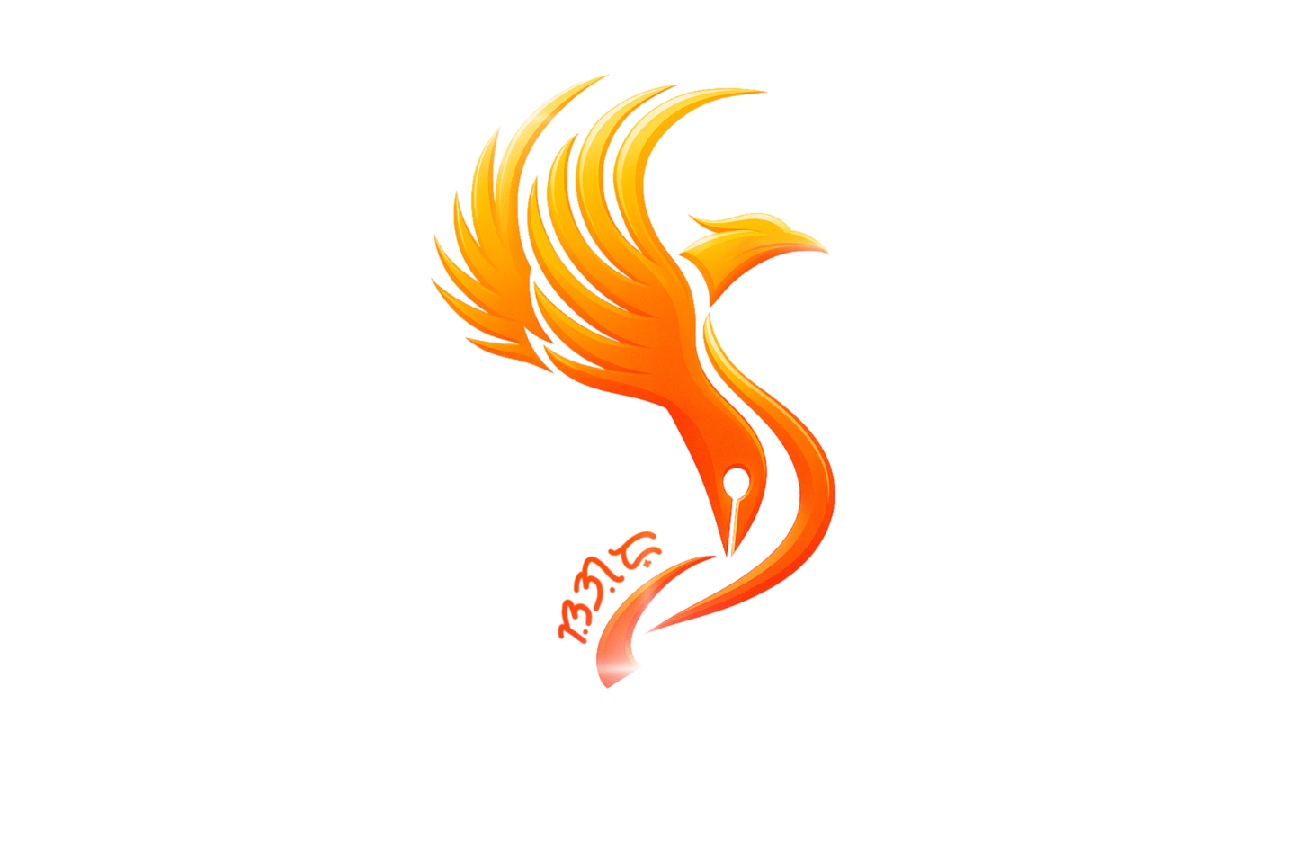
About the Logo
by: Rtr. John C. Tongco
The SUGOD logo powerfully blends symbolism and purpose. At its heart is aphoenix, representing renewal, passion, and the unstoppable spirit of Rotaract District 3860—always rising, always moving forward. Its12-feathered wings symbolizing the 12 councils which formed the district, which flow seamlessly into the form of a fountain pen, symbolizing the power of writing, storytelling, and advocacy. This fusion reflects the newsletter’s mission: to document, inspire, and ignite action through meaningful stories. The vibrant orange tones evoke energy, warmth, and optimism. The script at the base ties the design to cultural identity, reminding us that every story written is rooted in community and purpose. “Sugod” doesn’t just mean to move forward—it means to charge ahead with courage and conviction.